
Mobil menu:
Skifte farve på menu linie eller fjern linien
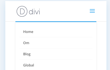
Today I show you guys how to change the blue line in the mobile menu of divi. Here are the codes: CHANGE COLOUR:
/* Change the mobile menu top border */ .et_mobile_menu { border-top: 2px solid #d9b310!important; }
fjern linien:
/* Remove the mobile menu top border */ .et_mobile_menu { border-top: none !important; }
Ændre farve på Hamburgermenu
span.mobile_menu_bar:before{color:#682e36;}
Bevar kolonner på iPad og Mobil i Divi
Steps to stop your columns from breaking in Divi on mobile:
- Add a class to the row > advanced CSS section (like “three-columns)
- Add the class to your stylesheet or custom CSS area
- Add .et_pb_column after the class
- Adjust the with accordingly (like width: 33.33%!important for 3 columns on mobile)
- You’ll also want to place this in a media query to make sure you don’t adjust the desktop version (see code below)
And that’s it! Easy peasy. And again, you can add this to all kinds of elements in Divi. Images, text boxes, icons, blurbs and more!
Here’s the CSS I wrote in the video:
@media only screen and (max-width: 980px) { .three-columns .et_pb_column { width: 33%!important;}}@media only screen and (max-width: 479px) { .three-columns .et_pb_column { width: 50%!important;}} |
Here are some example CSS class and code options you can use for any row moving forward!\
@media only screen and (max-width: 980px) {.two-columns .et_pb_column {width: 50%!important;}.three-columns .et_pb_column {width: 33.33%!important;}.four-columns .et_pb_column {width: 25%!important;}} |